As a companion to the evergreen Olympic archery pictograms piece I published a few years ago and recently updated to include the Tokyo 2020 series, I found this awesome blog post by Maraid Design who has found some wonderful matchbox designs from the 60s and 70s Games.
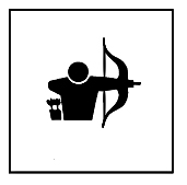
The stylised archer (above) is derived from the full set of pictograms designed by Nikolai Belkov, a graduate of the Mukhina Arts School in Leningrad. However, I’m not sure who came up with the chap below, who has a touch of the Egyptian warrior about him, with a decidedly up-the-revolution worker’s cap on top.
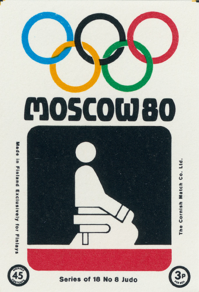
See the full set here. I particularly love the judo one, apparently unique amongst Olympic pictographic depictions in that it doesn’t show two fighters engaged in combat.
The Olympics aren’t the only time archery has appeared on matchboxes, as these covetable charmers from Finland and Poland, prove:
BONUS: something from the Brisbane Commonwealth Games of 1982
In Lausanne at the weekend I visited the Olympic Museum, one of the town’s best known attractions, in the home of the IOC. There’s not much dedicated archery material apart from the bow Zhang JuanJuan used to win the women’s individual title in Beijing, but it isn’t really about sport-specific stuff. If you are interested in the Olympics generally I recommend a visit if you’re in that part of the world.
My favourite part was the section dedicated to Olympic design and communication. One of the most popular posts I have ever put up here was the the piece I did about Olympic pictograms, which still quietly ratchets up thousands of views every year.
Outside archery I have an extensive interest in design and typography, and the best Olympic design work is enormously influential on spreading ideas about visual design, as well as becoming part of national identity and collective memories, shaping global perceptions for decades to come. I still think the clean, modern ‘Swiss’ work done in the late 60s and early 70s remains particularly strong.
The designs for the first two Japanese Games – Tokyo ’64 and Sapporo ’72 – were exceptionally good. I really hope that whoever is on the case for 2020 delivers something that matches them.
There’s plenty of resources about Olympic design on the web, I recommend Adam Harris’s Pinterest page as a good jumping off point.
that radio is awesome
Awesome Mexico ’68 dresses, actually worn by some of the volunteers!
Original logo designer Kenjiro Sano. Pic via Inside The Games.
Last year a furore erupted over the logo design for the Tokyo 2020 games, which was eventually withdrawn over claims that it had been plagiarised. I retain a sneaking suspicion that it was withdrawn not because it infringed the copyright of an obscure Belgian theatre company, but because it was really, really awful. I wrote a longish, ranty blog post about exactly why so in July last year.
Certainly the glare of public opinion was not kind, but the London 2012 logo received similar levels of stick, and they stuck that one out. Given the loss of face involved – a huge deal in Japan – the decision to yank it must have been agonising.
Since that debacle, the organising committee held an open public competition to design a new pair of logos for the Olympic and Paralympic Games. Anyone resident in Japan could enter, and nearly 15,000 people did. The four finalists, all currently anonymous, are below.
The reaction from Japan’s design community to the finalist designs has been spectacularly sniffy and condescending:
“Public submission seems more fair than a designer or agency picked by an elite, but the overall result will probably lack quality,” said Benjamin Thomas of Tokyo-based Bento Graphics, who said the logos on the shortlist fail to “immediately visually explain their concept”.
Another Tokyo-based designer, Ian Lynam of Ian Lynam Design, said the logos were “unprofessional in terms of structure, form and execution” and were more akin to “cartoons or caricatures”.
Designer Keiko Hirano said: “We must not fail to recognise that once again, the renewed competition will not be a reflection of the consensus of the Japanese people.”
Art director and the chairman of Japan Graphic Designers Association, Katsumi Asaba, told Sports Hochi said he preferred Sano’s effort as the new contenders were of a “really low level of design”.
This, of course, came hot on the heels of another, even bigger design row over the main Olympic stadium involving the late architect Zaha Hadid. After that, the organising committee made it very clear that they expected ‘Japanese-ness’ to be a big part of any design elements that were facing the public.
So here they are. What do you think? Personally I think that one is a lot stronger than the others. There’s a poll at the bottom. Choose one and let me know. Add a comment, why dontcha? And you can stick your oar in directly to the organisers here.
Chequered patterns have been popular in many countries around the world throughout history. In Japan, the chequered pattern became formally known as “ichimatsu moyo” in the Edo period (1603-1867), and this chequered design in the traditional Japanese colour of indigo blue expresses a refined elegance and sophistication that exemplifies Japan.
Composed of three varieties of rectangular shapes, the design represents different countries, cultures and ways of thinking. It incorporates the message of “unity in diversity”. It also expresses that the Olympic and Paralympic Games seek to promote diversity as a platform to connect the world.
B. Connecting Circle, Expanding Harmony
“This design expresses the connection between the dynamism of the athletes and the joy of the spectators, and the expansion of peace and harmony throughout the world. It seeks to encompass mental and physical strength, dynamic movement and speed, and the euphoric emotions that the world derives from outstanding athletic performances. The design also expresses the respect and warm hospitality that will be accorded to visitors from around the world to the Tokyo 2020 Games.”
C. Surpassing One’s Personal Best
“These emblems were inspired by the traditional Wind God and the Thunder God, and seek to convey dynamic movement at the instant an athlete breaks the tape on the finish line. They also represent athletes as they endeavour to attain and surpass their personal best. The Wind God and the Thunder God have been much loved by the people of Japan for centuries. (e.g. the famous painting by the early 17th century Japanese artist Tawaraya Sotatsu, and the statues of these Gods at the Kaminari-mon Gate in Tokyo’s Asakusa district) In the original depiction, the taiko drums held by the Thunder God are represented by fireworks, while the Wind Cloth held by the Wind God is replaced by the portrayal of a rainbow to symbolise the concepts of peace, diversity and harmony. The emblems also express the athletes’ continued contribution to peace through their mental and physical tenacity, and a connection to the future.”
D. Flowering of Emotions
“The morning glory flower as it faces up towards the heavens to greet the new morning, expresses the faces of athletes striving to attain a personal best and the bright faces of people as they applaud the athletes. The upward-looking morning glory also represents the climax of this range of emotions. The seed of the morning glory sprouts, the vine grows, and the flower opens,—the process of the flower growing and eventually returning to seed conveys the sense of expectation for the Games and succession to the next generation. This flower was particularly popular during Japan’s Edo period (1603-1867), and remains a firm favourite (e.g. as subject for “Ukiyoe” prints.) It signifies a heightened sense of anticipation towards the 2020 Games and the warm welcome that visitors from around the world will receive.”
Tokyo has unveiled its logos for the 2020 Olympics and Paralympics, and they’re awful.
From the awkward Clarendon-esque serif font – positioned too close to the image – that looks like something you’d see at the top of a stereo manual from the 1980s, to the simplistic, drab colour planes of the figure that look like something an unimaginative biotech company would leap on, it’s a hideous, retrograde mess.
The half-negative Paralympic figure is less bad, but they managed to screw the pooch by mixing the already-bad serif font with an gimcrack Gothic sans serif, the most overused, badly applied typeface style of the last ten years – and some commentators have suggested that it has been Frankensteined out of several other well known fonts. Mixing sans and serifs is always tricky – here it’s terrible, like two strangers forced to share a bed. It makes the much maligned London 2012 logo (which grew on me a lot) look like Swiss poetry in comparison.
It’s a shame, because it seems to want to reference the logo Tokyo developed for the 1964 Games; perhaps the single greatest piece of Olympic communication of all time.
The rising sun logo by Yusaku Kamekura, with its tightly condensed sans-serif brought modernist, minimalist design and typography to the world, marking a Games where Japan really came out of its post-war slump. He also designed several great posters which have influenced Games designers ever since.
Even the relatively unchallenging candidate city bid logo, with its cherry blossoms, ’64-aping red dot, and conservative DIN font, was better than the current final choice:
Still, perhaps it’s a grower. As mentioned, the engaging, divisive London 2012 logo grew on me a lot, although the typeface never did. It just seems like a missed opportunity to show the world a semblance of a new Japan, still reeling from nuclear disaster and long-term economic downturn.
But if the plans for the equally bad stadium design can be revised, maybe this can be too. Rant over.
UPDATE: September – The logos have been scrapped due to ongoing plagiarism row. Read more here.
Pictograms have been a part of Olympic design since they were first formally introduced at Tokyo ’64 – although they were employed by the IOC before that and have been a part of human communication since human beings have existed.
The stylised figures are designed to communicate information to all languages and cultures simply and unambiguously. They have to work at all sizes and in negative. In the connected 21st century they may be less vital to worldwide Olympic communication, but they are still a cornerstone of Olympic design, and often as a specific cultural expression too.
Here’s the Winter set for Sochi, just in case you don’t know what I’m talking about:
The Sochi set is based on the pictograms for the Moscow 1980 Summer Games. Come with me, and let’s have a look what designers worldwide for the Summer Games have come up with for the world’s oldest sport.
TOKYO 1964
The first systematically designed set of pictograms for both sports and services was created for the Tokyo Games in 1964 by Masasa Katzumie and Yoshiro Yamashita, although there wasn’t an archery competition that year. This guy is a bit heavy-set for an archer, kind of Oh shaped, but no athlete comes across as very elegant in this set. Full marks for a quiver though, the last design that would bother. Not sure what’s attached to his hand though.
MEXICO 1968
There wasn’t an archery competition this year; the ‘target face’ below is for the shooting competition. Shame, because Mexico ’68 remains my favourite overall Olympic design by some distance.
MUNICH 1972 and MONTREAL 1976
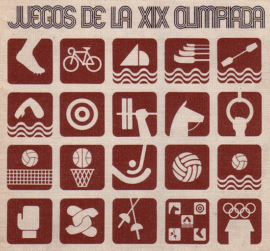
The pictograms designed by Otl Aicher for the Munich games were re-used four years later, and the full set is considered a design classic, endlessly copied and hugely influential on all that came after. Best of all, the archery competition was reintroduced after a 52 year absence. Unlike all the other little guys, we have someone shooting from behind. The head shouldn’t be at that angle, and the legs are waaah, but hey. It gives the impression of full draw, of effort. Of movement.
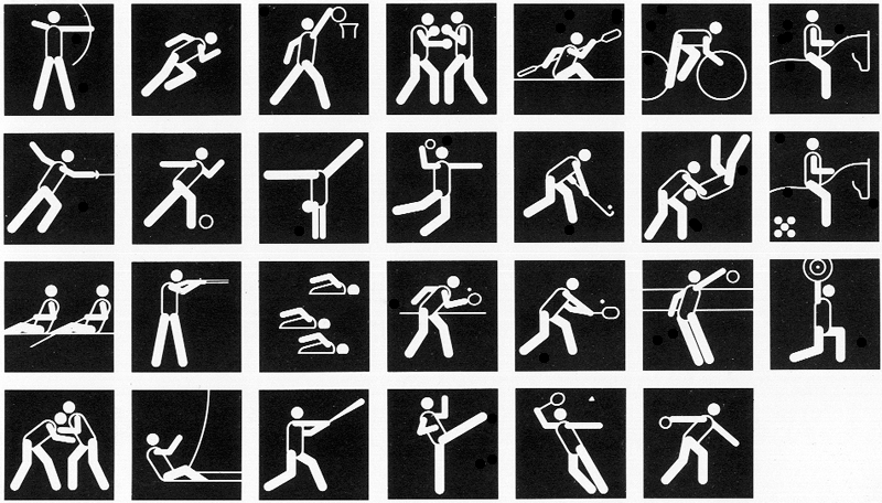
MOSCOW 1980
Nikolai Belkow won the competition held amongst students at Moscow art colleges to design the full set. Big stance, and rear elbow at some sort of realistic angle. The alignment is strong and relaxed. The flatter, rectangular shapes used that year added dynamism. Damn, this one is good. Also gave rise to a frankly covetable pin:
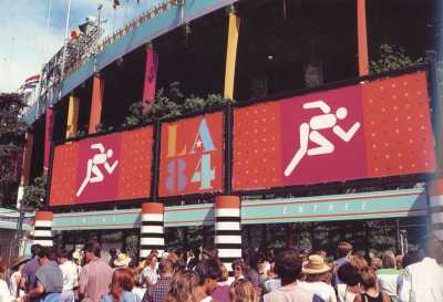
LOS ANGELES 1984
Not much to write home about here. Does the job, I suppose. Designed by Keith Bright, this was the first Games where a specific design brief has been handed down along with the full set, which is worth a read:
Clear communication; pictograms, by themselves, should be recognizable by people of other nations.
Consistency; the pictograms should be identifiable as a set, through uniform treatment of scale, style and subject.
Legibility and practicality; they should be highly visible, easy to reproduce in any scale and in positive or negative form.
Flexibility; the pictograms should not be dependent upon a border and should work equally well in a positive or negative form.
Design distinction; the pictograms should avoid stylistic fads or a commercial appearance and should imply to a worldwide audience that Los Angeles has a sophisticated, creative culture.
Compatibility; they should be attractive when used with their Los Angeles Olympic design elements and typestyles.
Via 1stmuse.com, here is some detail on how designs like these evolve: “In creating the new pictograms, exploratory sketches examined the use of partial figures, realistic figure images and speed lines combined with the figures. It was concluded that partial figures and realistic figures were difficult to decipher and movement associated with the figures made them too busy and impaired legibility. A simple figure composed of 10 fundamental body parts worked well: a circle for the head, an oval for the torso and eight simple parts representing the arms and legs. This modular figure, when placed against a grid pattern, could be recreated in any desired position, effectively portraying any Olympic event.”
SEOUL 1988
Full set here. Not much of an improvement on LA. I suppose the elbow is ‘better’. Once again, the designers used a standardised geometric pattern for the head, torso and limbs, with a slightly curious ’empty’ torso. This had excellent clarity and economy, especially in negative. But the retreads on 1972 were getting a bit tired. Luckily, four years later…
BARCELONA 1992
For the Barcelona Games they brought back in pictogram hero Otl Aicher. He based his work on the great logo design of Josep. M. Trias and its representation of the human body in three parts, with a broad brush stroke. This thing moves. It’s like someone dancing while drawing a bow. Great job. Full set here.
ATLANTA 1996
This archer is actually pretty good, poised firm, with his short bow and strong ‘open’ stance, but it’s a bit of a mixed year otherwise:
The canoe kayak looks like a trouser press, the handball looks like basketball, the wrestling like pat-a-cake and the judo like one of those Rorschach inkblots. Must try harder!
SYDNEY 2000
Again strongly based on the main Games logo, every single one of the full set of pictograms incorporates at least one boomerang. Was this really necessary? It obviously became a bit of a personal design challenge at points. Mr. Archer looks a bit heavy in the lower regions. Either that, or he’s wearing MC Hammer trousers. Full marks for the nods to an actual recurve bow, and the colour.
ATHENS 2004
The Creative Repository states this: “The Athens… pictograms were inspired by three elements of ancient Greek civilization. The simplicity of the human form is inspired by the Cycladic figurines. The artistic expression of the pictogram derives from the black-figure vases, where solid black shapes represent the human body and a single line defines the detailing of the form.” I say Mr. Archer lacks a bit of energy. Meh. Full set here.
BEIJING 2008
The design team based the pictograms on an ancient Chinese script. Full set here. Immensely simple, joyful, and communicative. First class. This also marked the first year that a full set of pictograms was designed for the Paralympics, with similar grace and economy:
LONDON 2012
The year the world turned purple. Well, we finally have an ‘Olympic’ recurve bow, with a sight (set to about the right place!) and a stabiliser. Terrible technique though, leaning back – either that or the perspective is a bit unclear. The riser does look a lot like a classic chunky Hoyt Gold Medalist or very similar:
…which suggests that the designers were looking at some very old pictures when they blocked it out.
I’m generally ambivalent about all the London 2012 design. The much-maligned logo grew on me a lot, although the font they used never did. A full set of London 2012 pictograms and lots more stuff here. (If you haven’t yet read my reviews of the three archery sessions I attended, you could do that here, here and here.)
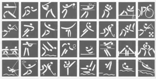
RIO 2016
Full set here. “The pictograms are set within pebble shapes, “which are a characteristic of Rio 2016’s visual language, support the designs and alter their shape according to the athletes’ different movements.” Righto. I’m guessing the designers were finally looking at some arrow-leaving-the-bow-shots when they conceptualised this, a product of the high-speed digital photography age. I do love the taekwondo one, more than the slightly un-dynamic archery designs:
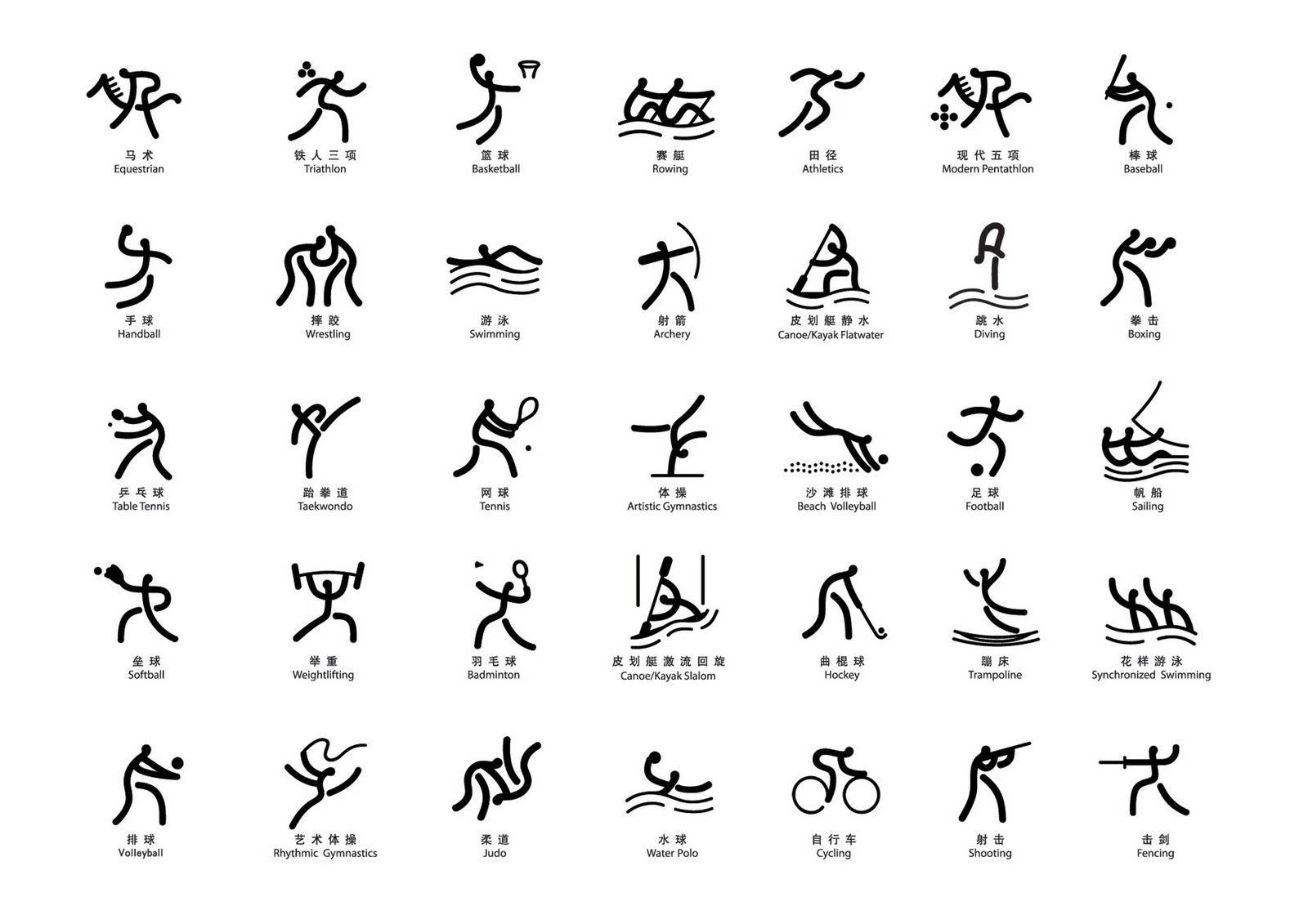
TOKYO 2020
The Tokyo pictograms, created by a team led by Japanese designer Masaaki Hiromura, were finally unveiled on 12 March 2019, and the bare-bones archery one is looking strong .The draw with the anchor point ‘below’ the head just possibly might be giving a nod to kyudo, the traditional Japanese archery martial art.
The traditional feel extends to the simple arc shape of the bow, although a kyudo bow is asymmetrical. It looks more like a longbow. Actually, it looks most like a PVC pipe bow than anything else. (It should be noted, if you scroll back up, that only a tiny handful of designs have depicted a recurve bow).
It communicates the sport well, although archery is lucky in that it has a single universal symbolic image to depict – several other Olympic sports, such as wrestling and modern pentathlon, struggle to be squeezed into a tiny square.
This is the Paralympic pictogram:
The full set is below:
On first impressions, I don’t think Hiromura has delivered a classic set for the ages. It’s kind of a hybrid, taking the basic body part vector building blocks of Aicher et al (see above) and tries to impart in them a bit of grace and movement. There’s a focus on the athletes more than the sports these days, and a set like Mexico ’68 (still, in my opinion, the greatest complete piece of Olympic design ever) wouldn’t get through a committee.
The Tokyo set is also kind of a ‘greatest hits’ of Olympic pictograms. Many seem to nod back to previous sets, especially Atlanta ’96, which appears to have been the inspiration for several, including, perhaps, our square-on archer.
The taekwondo one seems to be borrowed from Rio (scroll up). However, he has come up with a few originals. I really like several of them: baseball and table tennis especially. And full marks for a blank-slate attempt at skateboarding. But modern pentathlon and triathlon? They look like something you’d wipe off a kitchen surface.
As a complete set, it is a little conservative. You feel it could show a little more personality, a little more of the host nation. And the design exercise can add a little colour and joie de vivre to the meet – this brilliant and fun Jelly Babies set from the last Youth Olympic Games proves it.
But after the debacle of the logo a couple of years back, it is clear that the LOCOG design committee in Japan are taking no chances.
Pictograms are a major undertaking these days, particularly as each one now has to be approved by each sporting federation. The Tokyo ones apparently took two years from start to finish. As well as the individual sports, pictograms are produced for all sorts of ancillary Games services – some more successfully than others. Designers in the internet age now come up with their own sets which they hope will go viral. You may enjoy this video by Steven Heller, too.
This post has been heavily reliant on work done by the Creative Repository, the works of 1stmuse.com here, Olympic-Museum.de, and many other helpful uploaders. Thanks very much!


